TABLE OF CONTENTS
This guide is designed to help users efficiently navigate and utilize the platform’s core functionalities, with a focus on logging in, managing installations, and mastering list page features. By following this guide, users will gain the confidence and skills needed to optimize their experience and productivity within the platform.
1. How to log in
- Click on the link to log in Breece Cloud - Link will be provided during user registration.
You are directed to the login page as shown below.
- Enter your username and password in the designated fields.
- Press 'Continue'.
2. Installations
After logging in, you're taken to a page with key actions like collapsing the hierarchy, focusing on active installations, using global search, viewing the company list, accessing the Ctrl+K shortcut, and exploring the three-dot menu options, as shown below.
Note: All groups, sub-groups, and installations are accessible that are present across various cloud environments.

1. Collapse All - This action reduces visual complexity and hides the full hierarchy- Group, Sub-group, or installation.
2. Focus Active Installation -It enables fast access by highlighting the last-used group, sub-installation, or installation.
3. Global Search: Find Group, Sub-group, or an installation.
4. Groups/Sub-groups (red): A group is a top‑level unit used to manage and delegate system rights. Its permissions and settings automatically apply to all linked installations.
A sub‑group is a child unit within a group that provides additional hierarchy and more detailed rights delegation. It inherits and passes down the group’s settings.
5. Installations(yellow): An installation is a complete, functional system ( sometimes linked to a group or sub‑group). It operates using the products, designs, and settings defined for it.
6. Sub-intsllation(Blue): A sub‑installation is an additional installation under a main installation. It shares the same base infrastructure but functions independently, with its own products and designs.
7. Three-dot icon: Offers "Select" and "Dashboard" options (please check the screenshot in Section 2.1 ).
8. Dashboard: For further details, check section 2.1.
9. Shortcut: Press Ctrl+K for a quick search - Group, Sub-group, or installation.
10. Profile icon: Manage your login details and change the languages like German/Danish/Swedish/Dutch/Norwegian/Italian.
2.1 Row actions
Three dots appear next to each Company, Group, Sub-group, Sub-installation, and Installation.
- Click on the 3 dots.
Two functions are available: Select and Dashboard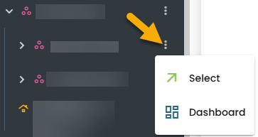
- Place the cursor on an Installation.
- Click on the 3 dots.
- Click 'Select'.
It opens to a new page with a side menu with 'Dashboard' highlighted as shown below.

1. Total Jobs: Displays the total number of jobs and acts as a clickable link that opens the Displays list page.
2. Low battery: Warns when battery levels are low and acts as a clickable link that opens the Displays list page.
3. Failed: Shows how many displays failed to process a job and acts as a clickable link that opens the Displays list page.
4. Antenna: Indicates the number of antennas in the installation and acts as a clickable link that opens the Antennas list page.
5. Products: Shows the number of products currently in use and acts as a clickable link that opens the Products list page.
6. Job handlers: Visualizes the stages of job processing.
7. Displays: Summarizes key information about all displays.
8. Processing now: Shows how many displays are currently processing and acts as a clickable link that opens the Displays list page.
9. Failed: Shows the number of jobs that failed and acts as a clickable link that opens the Displays list page.
10. Steps: Illustrates each stage of the job workflow.
11. Actions & Dates: Lists jobs and provides a day/week/month execution overview.
12. Product Import: Shows the import timestamp, product count, and success/failure status.
13. License: Displays the installation’s license key and usage of displays and BreeceGo devices.
Click on the 'Displays' as shown below.

A new page opens with two tabs—Displays, Antennas with 'Displays' selected by default.

These are the most common features across all the pages.
- Global Search: Quickly locates specific information across the system, with search options varying by page context.
- Filter: Narrows results using specific criteria to help users quickly find relevant information.
- Table Actions: Enables bulk operations, with available actions varying by page context.
- Settings: Choose which columns appear on the display page.
- Select All / Multi-Select: Use checkboxes to select one or multiple items.
- Sort Icon: Sort column data in ascending or descending order.
- Filter Icon: Apply filters to columns based on chosen criteria.
- Column Resizer: Drag column lines to resize; width settings are saved for future sessions.
- Three Dots & Row Actions: Click the three-dot icon to access more row-specific actions varying by page context.
3 Common features of a list page
3.1 Core elements
3.1.1Sorting the columns
This function is available across all the list pages.
- Click on the sort icon.
It sorts data by serial numbers and product numbers.
3.1.2 Filter/Sort/Add - columns
This function is available across all the list pages.
- Click on the
 icon.
icon.
- Opens a 'Filters' slide-in panel featuring three tabs, as illustrated below.
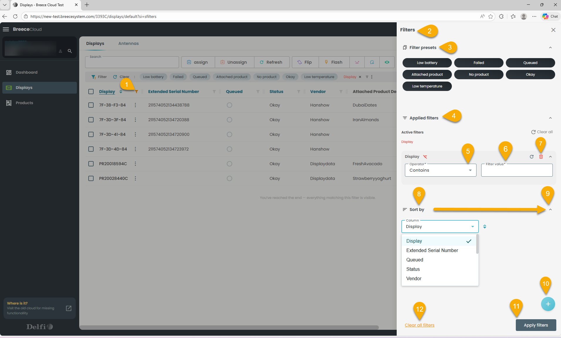
- Click the Filter (1) icon to open the slide‑in panel, which includes Filters(2), Filter presets(3), Applied filters(4), and Sort by (8)options.
- Filter presets: Select any preset to instantly filter the list.
- Active filters: Open the dropdown(5), choose an operator, enter a value(6), and select Apply filters(11) to update the list. Remove a filter using the delete icon(7).
- Sort by: Open the dropdown(9), choose a column, and the list updates accordingly.
- Add filters: Select +(10) to view available columns, add the ones you need, and select Apply filters(11) to update the list.
Note: check the screenshot below. - Clear all filters(12): Use this option to remove every applied filter at once.
 3.1.3 Column Settings
The Column settings icon is available across all the list pages.
- Click on the column icon as shown below:

Opens a slide-in with a list of columns.
Note: The blue eye signifies visible columns, whereas the strikethrough eye denotes columns excluded from the display list.
3.1.3.1 To hide a column
- Click the eye icon to hide the column; it will no longer appear in the display list.
3.1.3.2 To show a column
- Unstrike the eye icon to reveal the column in the display list.
3.2 Actions and Controls
3.2.1 Table actions(Bulk actions)
They support efficient bulk management and are tailored to the specific page you're on.
For example, consider how this works with displays: 
Slide-in:
Each table action opens a dedicated panel tailored to its function, with fields that vary based on the selected action.
- Click on the ‘+Add’ in the table actions.
Opens a slide as shown below (look at the back of the display to determine vendor):

Question icon: Offers guidance for navigating the process.
Hanshow: Click to add a Hanshow display to the installation.
Displaydata: Click to add a Displaydata display to the installation.
When clicking 'Hanshow'.
A slide-in opens as shown below.
Hanshow displays: Add displays - Slide-in:
Adding a Hanshow display follows the same process as Displaydata, except you must use either enter/scan:
The MAC address shown on the display, or
The extended serial number is printed on the back.
When clicking 'Displaydata'.
A slide-in opens as shown below.
Displaydata: Add displays - Slide-in:
This function allows you to add a display(s) to an installation. 
- Question icon: Provides guidance to help users navigate the process.
- Serial Number input field: Allows users to input serial numbers using three methods—File Upload, Paste, or Manual Entry.
- Displays counter: Shows the number of displays that have been added.
- Clear All: Removes all added displays from the list.
- Modes of adding displays.
- Add button: Becomes active only when displays are ready to be added.
- Cancel button: Allows users to exit and cancel the addition process.
Refer section 2.1.1 for further information regarding 'Modes of adding displays in this guide.
Link: Helpdesk : Breece
3.2.2 Row actions
Row actions are context-specific operations available for individual entries within a table.
- Click the three dots in the first column of each section/page.
A dropdown menu with row actions appears, varying by section.
The 'Details' is one of the row actions, which opens a slide-in panel with multiple tabs, each offering distinct functions and navigation options.
For example, consider how this is how it works in the case of displays - row actions:

- Header: Displays "Details" and the display's serial number.
- Top Actions: Assign, Unassign, Flip, Change page and Flash.
- Navigation: Use arrow icons to browse displays without exiting.
- Menu (three dots): Provides access to Refresh, Ping, Reconfigure, and Delete.
- Battery & Warranty: Shown via battery and question mark icons.
- Info: Shows the model and firmware version.
- Layout Configuration: Visual preview with type, dimensions, and page number,
Download the image by clicking on download icon (1).
Navigate to different layouts by clicking on (2,3) arrow icons.
- Content: Shows product number and name; clicking the number opens a slide-in with product details.